A McDonald’s Chatbot, and Its Paradox.ai Origins
Previous reviews: Inbenta, Wysa, Tonal, NASA, Planned Parenthood, Lowe’s
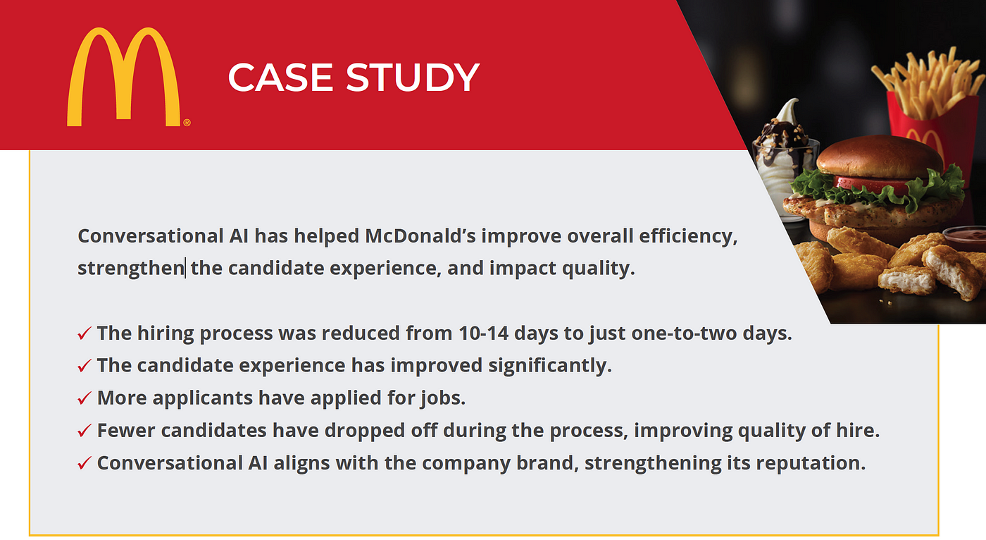
A recent report on conversational AI in recruiting and talent acquisition gave McDonald’s as a case study. An opportunity for a conversation design review! Below we’ll look at the McDonald’s jobs chatbot and the chatbot company (Paradox.ai) behind it. I’ll also share some thoughts on the discoverability problem for conversation products. To start, here is a screenshot from the report:
Finding the McDonald’s jobs chatbot
At the McDonald’s careers website, you are prompted to choose between restaurant jobs and corporate jobs. The Corporate path does not lead to a chatbot, but the Restaurant path does. Perhaps the volumes are lower for Corporate, and so the value of an AI is lower. I wonder also if there’s a branding component, where corporate jobs feel like they should get more personal treatment. That said, the corporate track asks you to search for a job and then submit an application, with no conversational engagement. It’s unclear to me if that is a premium experience.
The McDonald’s restaurant jobs track starts with some info and a search box.

Following their example query, I wrote “crew SF” to get started. This returned a list of matching jobs. When I clicked “APPLY NOW” on one of them, it launched a chat experience to apply. The page had a short description outside the chat window that you could read, the chatbot became the focus and the rest of the page faded to grey.

Using the McDonald’s jobs chatbot
The chat experience itself starts with four chat bubbles taking up the entire length of the screen (on my external monitor).

This is a lot of content to throw at a user from the very beginning. It may be okay because users could be fairly motivated to continue. That said, I’d love to know the results of an A/B test comparing this welcome to something shorter. Would drop-off be lower if the welcome content was reduced? What if it was broken up into multiple turns requiring user input to advance instead of 4 big bubbles?
So, what is happening in the user’s first chatbot view?

There is a lot here. I imagine the two bubbles I called disclaimers are a result of legal requirements and not a conversation designer’s preferences, and I empathize with those constraints. That said, it demands a lot of real estate at the very beginning of the interaction. They are presented as implicit acknowledgments (no user confirmation required), so perhaps they aren’t too disruptive.
I find it interesting that the disclaimers (bubbles 2 and 3) are in between the welcome (bubble 1) and the starting question (bubble 4). To me, in my imagining of the user’s experience, I expect the user would find bubble 4 important, bubble 1 fine but sort of forgettable, and bubbles 2 and 3 kind of annoying. As a result, I feel like disclaimers get in the middle of two things I care about.
Setting aside legal or other requirements, what would the user experience feel like if this chatbot only used bubble 4?
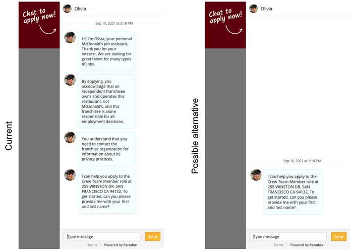
I often feel that conversational experiences get better as I cut material out of them. It is so easy to be overwhelmed by content. In this case, applying for a job is the core goal and other things might get in the way.
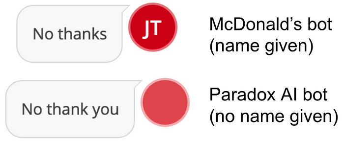
When I enter my name, I get the following:
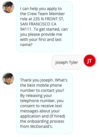
The bot seems to have processed my entry as a first and last name, and turning it into JT in a red circle. I don’t know what kinds of validation might be done here… what if I only enter one name, three names, or don’t enter a name at all?
Since I’m just testing the bot, I didn’t want to provide my phone or email.
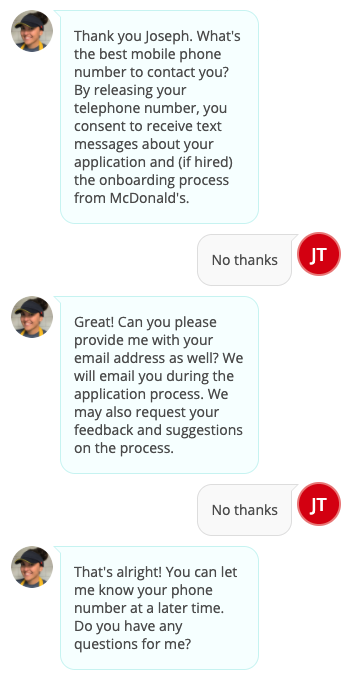
I’m not sure the “Great!” really fits, but generally the bot was gracious about me going outside the happy path.
The bot seemed to handle my question well! I wonder how complex the intent-matching behind the scenes is. Perhaps it’s cued on the word “apply” in my questions, perhaps it’s more elaborate. Regardless, it seems like getting my contact info is a precondition for continuing.
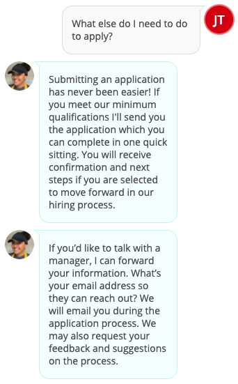
I tried a few more questions (pay scale, hours, responsibilities), the first two it deferred to talking to a manager and the third it gave an answer about using their scale for good. In all cases, the response was structured in two parts, for example:
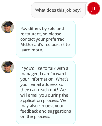
The first chat bubble is a response to the question, and the second seems to be a universal follow-up (though there were minor variations in the second bubble). Once the user gets off the happy path and is able to ask about anything they want, the bot has an answer-then-ask-for-contact-info structure.
Without providing contact info, I am unable to test the system further. I’m curious how much is done in the chatbot. I can imagine that all the bot does is collect contact info. I can also imagine that the bot does a broader intake flow, collecting work experience info, availability, preferences, and more. And it could be even more sophisticated, with deeper integrations, but that seems unlikely.
So, who made this chatbot?
It looks like it’s a company called Paradox.ai. Let’s investigate!
Paradox.ai: a conversational AI for recruiting
Looking at their website, it becomes clear the McDonald’s bot and the Paradox bot are based on the same technology. Both even use the name Olivia!
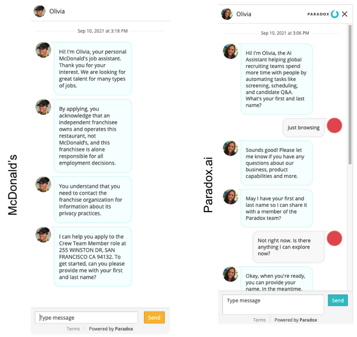
The main difference, other than the chat text, is the bot’s picture. The woman with a hat seems like a nice touch to frame the interaction as about working in a McDonald’s restaurant.
One thing I noticed about the chatbot on the Paradox AI website is that it is context aware. On the main page, you get different welcome content than on the careers page!
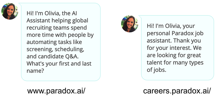
I am curious how this was implemented. Does the website initialize a different conversation, or is a single conversation aware of what website it is embedded in and then branches appropriately. The metaphor of “Olivia” as a persistent character would suggest the latter, but I’m guessing it’s the former. It may not matter that much, but if a single user is to chat with Olivia in various parts of the website, that user may expect consistency across contexts. As the side-by-side screenshots above show, the character Olivia introduces herself on the one hand as “the AI Assistant helping global recruiting teams spend more time with people by automating tasks like screening, scheduling, and candidate Q&A” and on the other as “your personal Paradox job assistant”. Is she both? Would it be better to use a different character for the careers page if the purpose of that chat experience is different?
Much like with the McDonald’s chatbot, the first question asks me for my first and last name. I’m curious why this is the starting point. Are they creating a user profile? What is the dropoff at this point? Is it valuable as a way of building a relationship or does it create unnecessary friction? It appears that the chat UI shifts from a red dot to a dot with your initials, once you give them your name. Perhaps they see that as an important part of the experience.
After I ask Olivia at paradox.ai a few questions, she follows her answer with the following:
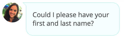
I wonder if it would help to explain why the name is wanted/needed. Or maybe this whole thing is an artifact of me just testing the bot.
Embedding Video
The integration of multimedia and multiple modalities into conversational experiences is an area of interest for me. At Sensely, we thought a lot about the role of an avatar in voice and chat interaction, as well as the role of images, video, markup and more. Paradox is doing something interesting! First, the Youtube video link is embedded in the chat flow:
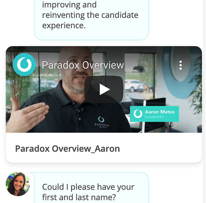
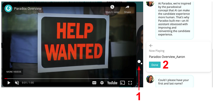
The video uses the full width of the chat UI, allowing for the largest preview possible. Once you click on the video, an animation starts with the two white circles (1, in screenshot below) expanding into the full Youtube video overlaid on the website. In addition, the video’s card space changes to the video name and a Done button (2). Clicking the Done button closes the Youtube video and goes back to the original look and feel.
One thing analyzing the McDonald’s bot together with the Paradox.ai bot allows is a comparison of a conversational AI company’s demo product with an actual implementation. How does Paradox.ai promote and use their own product compared to how a customer has used that product for themselves? In this case, the two products look quite similar. The general UI looks the same, some of the content shows parallels (the primacy of asking for first and last name), and even the character’s name. One challenge for conversational AI companies is how to make a product that has broad applicability out of the box, with customization to meet individual differences in customer needs. Paradox seems to have created a product that didn’t need much changing to serve the McDonald’s use case, other than building the actual dialogue flow and content.
Going back to the case study screenshot at the very top of this post, most of the bullet points reference improvements compared to some other hiring process. My analysis here has been internal to the bots. The analytics nerd in me would like to see how they got those comparative results, but also how to improve the chatbot by comparing results for different implementations of the chatbot.
A Reflection: The Discoverability Problem
Unlike visual interfaces (GUIs), it is difficult with chat and voice interfaces to know the scope of what is possible in the conversation. Just like it’s hard to know what Alexa can do without trying and learning, I’m finding it difficult to know what a bot like Paradox’s can do without brute forcing my own investigations. I have this sense that there is more it could do, and I just haven’t found it. Are there easter eggs? Fun features? I know I’m just trying the bots out to explore their design and technology, but I want to see their full bot schema! What are all the possible paths? How are they determined? What content is supported? What are the things this bot can and cannot do? I can discover by trying, building from the bottom up. But in doing so, I realize I want to see a high-level view. And this challenge gets into how conversation designers, and the tools they use, represent the conversations. I know this is something discussed in the book Conversations with Things (e.g. chapter 6 Documenting Conversational Pathways), by Rebecca Evanhoe and Diana Deibel. I’m wondering what might be a super clear and easy-to-understand way of representing a large conversation’s structure, the various paths, content, media types, decision logic, and more. That is, what might a conversation representation look like with a zoom function, such that you could zoom in to see all the details in a single state, but you could also zoom out and see the entire possibility space for interacting with the bot. There are many design tools out there (Dialogflow, Voiceflow, Botcopy, Botmock, OpenDialog are a few that come to mind). Perhaps in the future I’ll dive in to exploring how some of them approach this challenge.
Thanks for reading. You made it to the end!
Copyright 2021 Joseph Tyler All Rights Reserved
https://josephctylerwords.medium.com/a-mcdonalds-chatbot-and-its-paradox-ai-origins-406357578ae7