Review: Wysa
Previous reviews: Lowe’s chatbot, Tonal Home Gym Chatbot, Ask NASA Mars! ROV-E, Planned Parenthood’s Chatbot Roo
While reading about Woebot, a mental health chatbot that uses CBT (cognitive behavioral therapy) techniques, I saw a mention of another player in the AI chatbot for mental health space, Wysa! How do they approach the challenge of automated mental health services?
The first thing that jumps out about Wysa is the character that leads the way, a cute, cartoony penguin named Wysa.
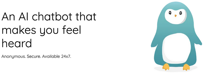
You can use the Wysa chat on the Wysa website, but it seems like the mobile app is probably what it is optimized for. I’ll walk through the web experience first. Before beginning a chat, the user is asked for a nickname. It’s a bit of friction before starting, but could help personalize the service, particularly if you create an account and return multiple times.
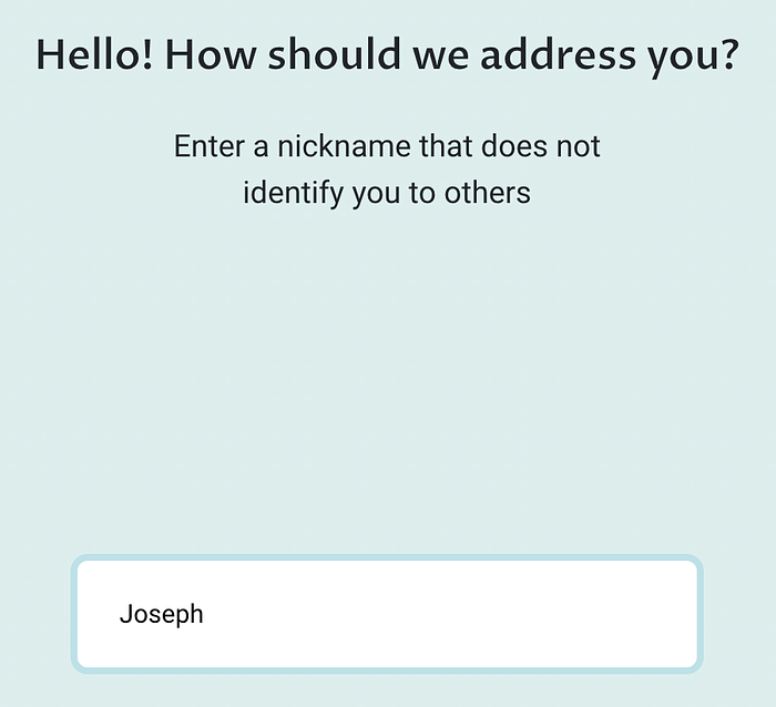
That said, a recent study showed evidence that users may be LESS likely to take advice from an AI bot when that bot knows the user’s name. In the study, participants felt that the bot knowing the user’s name was intrusive! It feels like there’s a deeper story to tell here about preferred relationships between bots and humans, but collecting a nickname may not always be experienced as a positive.
After entering your nickname, you get this welcome sequence:
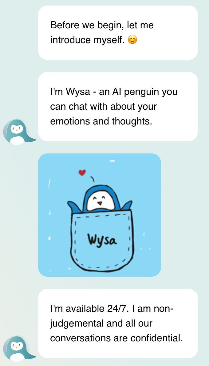

The first thing I noticed was that the content in this initial welcome was too much to fit on the screen at 100% zoom. The buttons at the bottom pushed the first speech bubble off-screen. I would have preferred all content fitting on screen, particularly given that this was the first turn of the conversation.
The first message serves a similar function as saying “hello”:
Before we begin, let me introduce myself. 😊
My sense is this lengthier preamble creates a somewhat more empathetic tone, acknowledging the context (before the beginning), and indicating the first order of business (“let me introduce myself”). How might this start feel different if Wysa had simply said:
Hi, I’m Wysa, your mental health bot.
This sounds so much more direct! Doing it their way seems to highlight the relationship work that Wysa wants to do (introducing itself), and sets the tone for the rest of the interaction being about trust, empathy, and a therapeutic alliance.
Next, Wysa says:
I’m Wysa — an AI penguin you can chat with about your emotions and thoughts.
Wysa’s self-description is notable for referring to itself as an AI, and for calling itself a penguin. Both of these choices reinforce that Wysa is NOT a human. I find this disarming. You don’t have to worry about the complications of a talking to a human (am I wasting their time? is this okay to ask?). And it’s a penguin! Who doesn’t like penguins?!
What does Wysa do? It can chat with you “about your emotions and thoughts”. The language is accessible and easy to understand. It doesn’t bring up clinical terminology or jargon like cognitive behavioral therapy. Seems like good framing.
Up next is a cute animation of Wysa, and a follow-up message:
I’m available 24/7. I am non-judgemental and all our conversations are confidential.
This conveys three pieces of information, 2 facts (available 24/7, confidential) and one opinion (“I am non-judgemental”). I like the facts, but declaring being non-judgmental feels like telling, not showing. To me, it is up to the user whether or not they feel judged. I would probably remove this.
The initial sequence concludes with two buttons that the user can choose from. “Start exercise” seems like the intended path, while “How can you help?” feels like an alternative explainer path. I go down the “How can you help?” path a bit; there is no “go back” option, so I type “exit” into an open-text field:

Given that my intent to exit the flow was not properly handled, I find Wysa’s referring to me as “friend” condescending. I get that the intention is to build rapport and closeness, but it feels wrong in this context. Then shifting back to the exercise feels a bit like railroading. I don’t begrudge it too much, since I expect that the exercise is what Wysa is there for, but I would have preferred an explicit acknowledgment of not understanding and then suggesting the exercise. The inclusion of a free-text entry field may be the problem. It was offered, so I used it. I wasn’t sure what my options were for open-ended text input, and I seem to have gone outside the guardrails.
Once I choose to start the first exercise, Wysa calls me “buddy”:
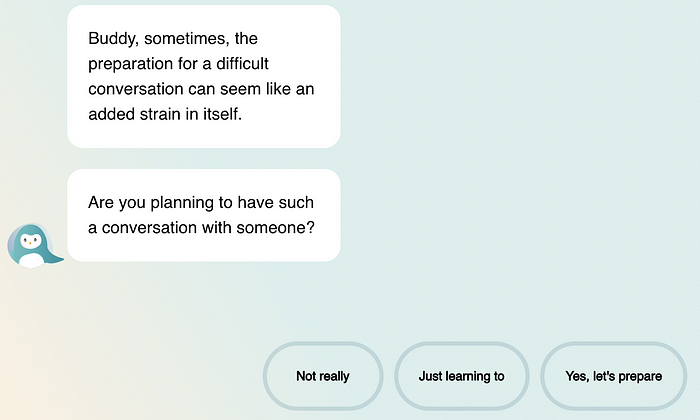
This use of “buddy” rubs me the wrong way. This may be a culturally variable reaction. I can imagine references like this, both when they happen and which terms are used, can vary a lot in how they are received. It happens again:
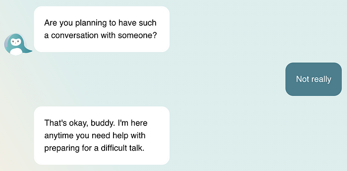
And when you try to close the chat:
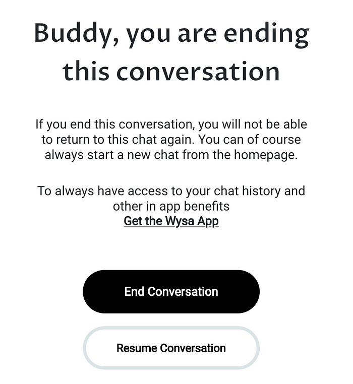
Wysa’s Crunchbase profile says the company is based in India. Perhaps this use of “buddy” resonates differently in India.
The UI
Like Roo, the Planned Parenthood chatbot (see my review), Wysa’s chat interface takes over the whole browser window. And like Roo, this serves well to create a sense of safety, without distractions from menus or a backgrounded website. The minimalism is comforting.
The color scheme is also comforting, with warm, soft yellows and greens, and smooth gradients. There are very few sharp edges in general. The colors are smooth. The buttons have large rounded outlines. The whole thing seems to exude softness.
The chat supports minimizing, which returns to the prior web page with a cute icon in the bottom right of the window:
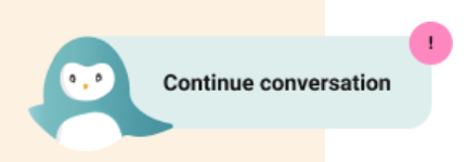
Clicking on this image brings the chat interface back up, and the full chat history is maintained. This is nice! No need to start over, it remembers where we left off. The use of pink for the badge, instead of red, helps soften the experience.
What about on mobile?
The above observations were for Wysa on their website, but how does it look on mobile? A first observation is that the mobile experience looks more polished:
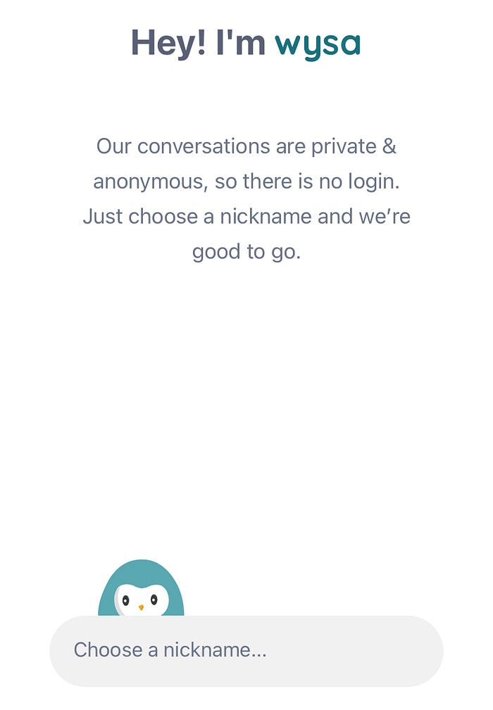
The text input field is cleaner, and there’s a penguin peeking over it. The fonts and colors feel more refined. It’s not clear to me why “wysa” is in lower case, while the web chat uses “Wysa” with upper case. After I enter my name, the app tries to have me select topics I want to focus on to start, which did not happen on the website. My impression is that the web version is only a demo. The mobile app is the flagship product.
The app itself bifurcates into 1) self-care, and 2) talk to a therapist (with prices). Wysa’s business model may be to serve as a point of entry and referral service to mental health therapists. The main menu offers many different tools (more are available below the fold):
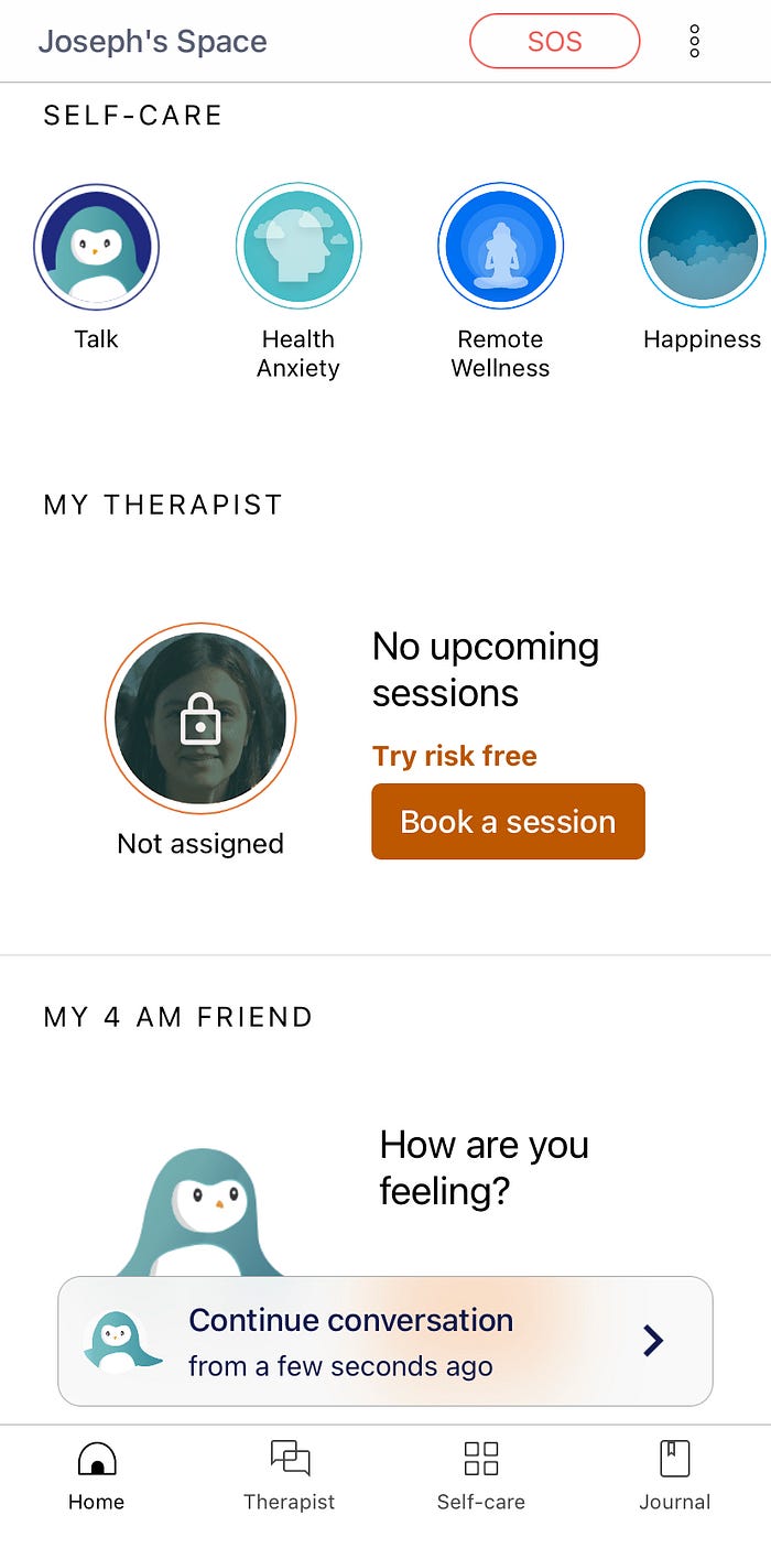
At the bottom of the screenshot is a “Continue conversation” option, with a time indicating how long ago it took place. I had tapped on “Talk” in the top left; once I exited I came back to this menu. If I tap “Continue conversation”, I can pick up where I left off. If I tap “Talk” again at the top, it opens the chat interface but starts something new!
I wanted to get back to the beginning of the chat experience (to get a screenshot), but every time I start it now it skips the initial welcome sequence:
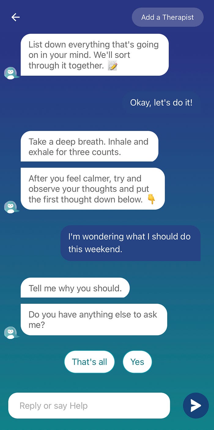
I like the activities of breathing and writing down your thoughts, but I’m not sure how I got into this activity. After I share a thought, Wysa follows up about what I wrote, and asks me a question. I’m confused whether I should respond to the “Tell me why you should” command or the following question.
Conclusion
The Wysa app uses an AI penguin bot to engage in mental health conversations, in a soothing, colorful, calm interface. The app seems to include a variety of mental health content, delivered via chat, but also with links to audio and video clips. The quality of the content probably drives the value of the app (I haven’t tested much of the content). The app itself seems to be a scrollable page of clickable icons and widgets, with conversational UI when you open an exercise or widget. I sometimes struggled to navigate between the app menu and the conversational interaction, but I’m intrigued with how they are trying to mix the two modalities.
Copyright 2021 Joseph Tyler All Rights Reserved
