Review: Planned Parenthood’s Chatbot Roo
Previous reviews: Lowe’s chatbot, Tonal Home Gym Chatbot, Ask NASA Mars! ROV-E
I was recently catching up with a friend in the world of conversation design, and she mentioned Planned Parenthood’s chatbot Roo. What an interesting use case! How would they approach conversation design for teens on the topic of sexual health? I decided to give it a try.
Onboarding
Roo was different from many other chatbots I’ve used. The experience takes over the whole browser window. Unlike a drawer, there is no background over which the chat is overlaid, and there are no animations to distract from the chat itself. These interface decisions helped create a sense of safety for me, something personal, somewhat analogous to a confidential discussion with a doctor. I’m guessing this was on purpose.

During onboarding, Roo is introduced thusly: “I’m a bot that’s here to answer your questions about bodies, sex, and relationships!” The user is asked a few questions about themselves, including age, ethnicity, and gender. Choosing the 20+ category, I was told that Roo is for teens, but was still allowed to continue.
The chat UI
Once onboarding is complete, you start the chat.

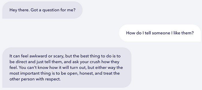
When you click in the text input field, the whole screen changes to a list of suggested questions with the open-ended text input field at the top of the screen. The result is a nudge toward questions that are supported, while still allowing open search. I tried the first question:

The response is simple and direct. It is empathetic and focused on the user. In fact, the character Roo is backgrounded, with no references to their capabilities. Additionally, there is a formal match between asking if the user has a question, and the suggested responses being actual questions. Not all bots do this! But it helps make the interaction feel more natural.
After maybe 10 seconds, a “Want more info?” question appears. Sometimes I find structured delays like this annoying; I didn’t on my first time through, though it was annoying a second time through (to get the screenshot). Saying “Sure” presents a carousel of cards, each of which links to a web page with more information. I like this general approach of short content in the chat and longer-form content available as links to web pages.

The character Roo
In my interactions with Roo, I never got a sense of whether Roo had a gender, or really even any backstory. The only question that addressed Roo’s identity elaborated on their name.

The animations
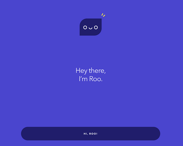
The character Roo is a minimalist head with simple, playful animations.


At one point there was an explosion of confetti, adding a playful touch.
Handoff
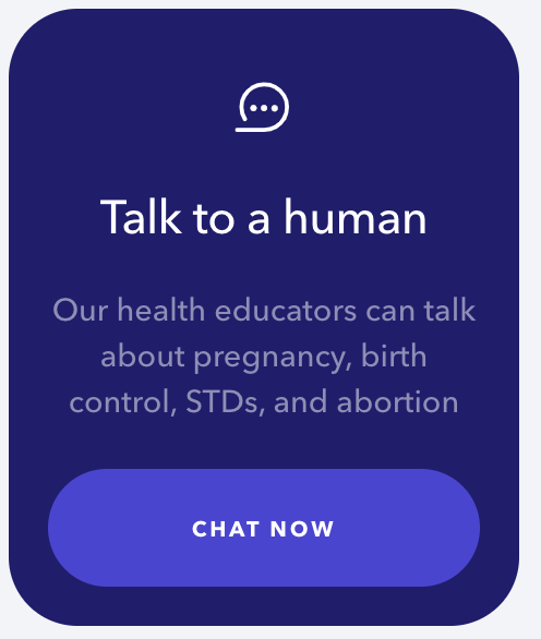
In multiple places, Roo offers the opportunity to chat with a human, though no humans were available when I tried. While some bots automatically transfer a user to a human, in this case the user is offered the option to talk to a human. This puts the user in the driver’s seat.

The technology
Looking at the page’s source code, Roo appears to be custom development, not an integration of someone else’s bot code. This isn’t surprising, given the unique look and feel of the interface.
Conclusion
The Planned Parenthood bot Roo seems well made, carefully designed for an audience of teens with questions about sex. The interface feels clean and polished, playful with animations and thoughtful dialogue, and focused on the core purpose. The bot mixes communicating information directly in the chat with linking externally for deeper exploration, be it reading an article or connecting with a human to talk to. And with an interface that takes over the whole window, it creates a sense of privacy that seems well-suited to discussions about sensitive topics.
Copyright 2021 Joseph Tyler All Rights Reserved
