Review: Tonal Home Gym Chatbot
Previous reviews: Lowe’s chatbot
In a recent conversation with a friend, the company Tonal came up, so I went to their website. What do I find there but… a chatbot! Another opportunity to explore a chatbot in the wild, look at how they did their design, try it out, and see what can be learned.
The UI: a drawer implementation
Much like the Lowe’s chatbot from my last review, Tonal starts with a drawer implementation, i.e. an overlay in the bottom right corner that when clicked opens a chat window.

I like the use of the Tonal logo as the drawer icon. This icon has a red ‘1’ badge in the upper right corner, suggesting an unread message. This is my first time to their website, how could I already have a message? From my smartphone experience, I feel drawn to click it, even if just to get rid of the badge. In addition, there is an ‘earcon’ audio sample that plays when the drawer loads.
In general, I prefer not to hear unexpected audio when I go to a website, so it caught me by surprise. There is also a grey ‘X’ on the left. When I click it, the chat bubble disappears and the red ‘1’ badge goes away.

While all of this is happening, the title text in the browser’s tab at the top of the screen animates between two text strings.
- “Tonal: The World’s Most Intellig” (the rest of the title is clipped by the tab’s available space) and
- “(1) New Message!”.
This is another cue driving attention to the chatbot. I can imagine this being particularly effective when you have multiple tabs open and have forgotten what they all are. The flashing text demands your attention. This may be a mix of effective and annoying.
Once I’ve opened the drawer, there is an ‘X’ where the Tonal logo used to be, which I assumed would close the drawer.

Clicking it didn’t do anything. The overlay of the chat window over the ‘X’ suggests that this was unintended. When I changed my browser zoom from 100% to 90%, the dimensions looked better.

At this zoom level, clicking the ‘X’ closed the chat window.
The conversation
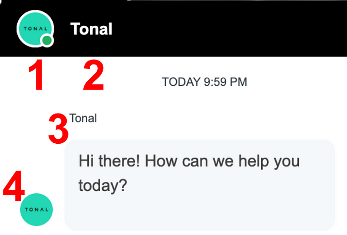
When launched, I notice that “Tonal” is displayed four times on screen: in the black header bar as an icon and as a title, in text above the chat bubble, and as an icon again to the left of the bubble. This feels like overkill. The initial chat bubble also has an extra newline, making the bubble 3 lines wide even with only two lines of text. I’m not sure what the “TODAY 9:59 PM” is for, since I’m presumably aware of the time when I first interact. If state is maintained somehow, and when I return in the future I can see a chat history, then this time indicator could be useful.

The first thing that the chatbot says is “Hi there! How can we help you today?” To understand this message, let’s revisit the welcome message model from the Lowe’s review:
1) Greeting: Hi!
2) Introduction: I’m MyLo, your Lowe’s automated assistant.
3) Orientation: Here’s what I can help you with.
4) Pre-repair: Type “menu” if you need to start over.
In the case of Tonal.com, it appears to be:
1) Greeting: Hi there!
2) Introduction
3) Orientation: How can we help you today?
4) Pre-repair
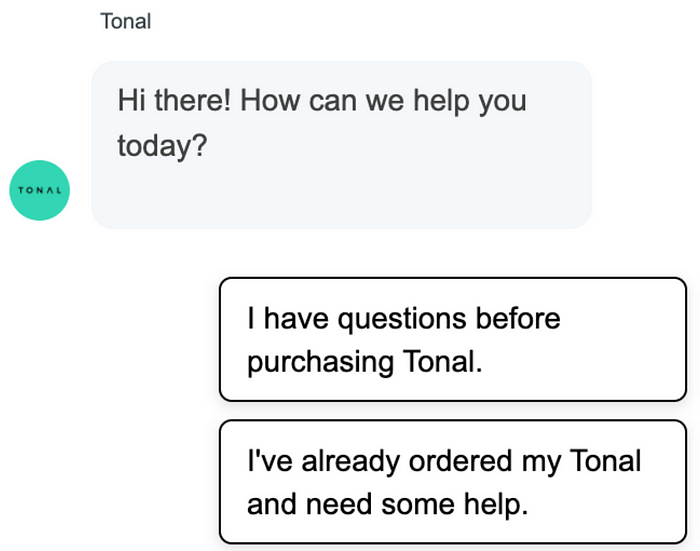
I like the succinctness. Interestingly, this bot doesn’t introduce the bot as a character with a name (there’s also no picture of the bot as if it were a person). Also, no instructions are given on how to use the bot.
This initial state has two buttons the user can choose from.

Unlike the Lowe’s bot, there is no open-ended text input field, meaning these two buttons are the user’s only options. The initial question in the unopened drawer text, “How can we help you today?”, is broad in scope. The help a user might need could cover a broad range of topics. And yet, once the user has opened the drawer, the conversation is limited to help with making a purchase and checking on a purchase. I try the first option.

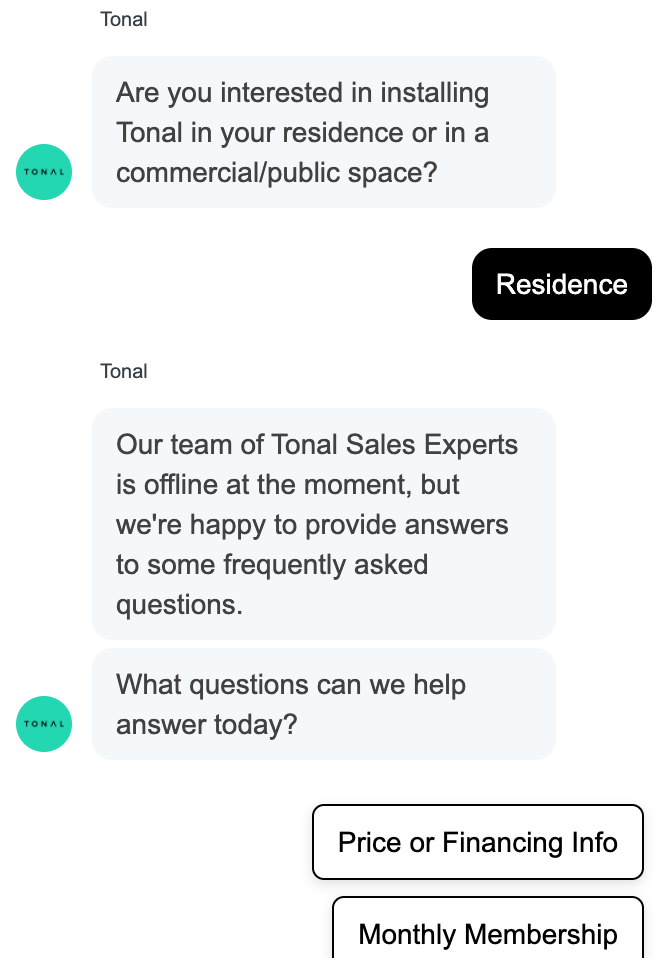
From the phrase “Our team of Tonal Sales Experts is offline at the moment,” it seems that the bot was trying to do an AI-to-human handoff, but was blocked by the time of day. It’s unclear if I would have been given the option to choose a handoff to a human or if it would have been done automatically.
It was unclear to me why I was asked about residence vs. commercial/public space before the bot checked if it was during office hours or not. When I retried and selected “commercial”, the bot did not attempt a handoff to a human agent. Since only the residence path tries to hand off to a human, it’s reasonable to ask first if the interest is for a residence. That said, I would have liked some transition text explaining to me why the bot was attempting to hand me off, for example: “For questions about Tonal for residences, it’s best to set you up with a human agent.” Absent this kind of explanation, I have to guess at why it matters that the sales experts are offline.
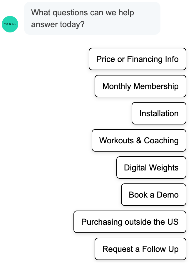
Instead of a handoff to a human, I was offered the FAQ menu.

It’s a bit odd to be asked about “what questions” when the available options aren’t questions. It’s not hard for a user to accommodate to the bot, but it is a formal mismatch between the bot’s question and the options.
Like before, there is no open-ended text input option. Given the narrow goals for the bot, the constrained functionality makes sense. On the other hand, the framing of the bot seems to be about general help (“How can we help you today?”), or general questions (“What questions can we help answer today?”). These questions imply a broader domain of support, e.g. any help, or any questions. The bot itself is much more constrained.
The technology
From inspecting the web page’s code, it looks like this bot is being powered by the chatbot platform Drift. I’ve seen them behind the scenes on other web-integrated chatbots as well. Drift’s LinkedIn page says “Drift helps companies engage in real-time, personalized conversations so they can build trust and accelerate revenue.” They seem especially focused on adding chatbots to websites to help with sales conversion. Many of the design features discussed above seem standard to the Drift integration, as seen on the Drift website.
Concluding thoughts
The Tonal chatbot uses multiple cues to call attention to the drawer. It pitches broad domain questions about “help”, but then narrows the discussion quickly to sales. While there are some FAQs, the goal seems to be to hand off to a sales agent as quickly as possible. I wonder how similar this is to other Drift implementations!
If you try out Tonal chatbot, let me know what you think!
Copyright 2021 Joseph Tyler All Rights Reserved
